
Clearer staging
This project focused on improving the Directed Staging feature within Ocado's store app a tool used by operatives.
I initiated this work after identifying recurring usability issues in the flow, then owned the UX process end to end from shaping the research approach and analysing the experience to proposing the redesign direction and leading the changes forward.
Research
Usability testing
Heuristic analysis
My role
Planned the research approach around project constraints
Defined the usability test focus and research questions
Ran the test sessions and synthesised the findings
Proposed and led the redesign of the affected screens
Influenced the team and stakeholders to adopt the proposed changes
Problem
Store operatives were misusing this feature, and team members themselves also showed confusion about the screens.
With limited access to real users, finding the issues required creative research methods.
Solution
I ran usability tests using our office mock-up store and conducted a heuristic analysis of the existing flows.
Together, these methods surfaced specific issues with labelling, information hierarchy, and layout that were causing confusion.
Impact
The new flows required minimal engineering effort yet delivered results: shorter training time and clearer flows for users. Several clients requested the same approach for other flows.
The project proved to the team that even limited research can drive meaningful design decisions.
Background
Directed Staging helps store operatives place bags for Click & Collect orders on shelves. Our system has no shelf-layout data, so we can't tell operatives exactly where to place a bag. Instead, we show them where the other bags from the same order already are, and they decide placement from there.
The feature was meant to guide users through this flow, but in practice it was causing confusion for store operatives, for team members, and for our Partner Success team. The screens were misleading for everyone.
Research plan
There were several constraints to investigate the issues with the current flow. I had to find a practical way to learn quickly and still produce reliable design direction.
So, I created this research plan that worked within what was realistically possible:


Research plan
There were several constraints to investigate the issues with the current flow. I had to find a practical way to learn quickly and still produce reliable design direction.
So, I created this research plan that worked within what was realistically possible:
Research plan
There were several constraints to investigate the issues with the current flow. I had to find a practical way to learn quickly and still produce reliable design direction.
So, I created this research plan that worked within what was realistically possible:
Heuristic analysis
Before involving participants, I conducted a solo heuristic analysis. I identified the key user flows and mapped design principles to evaluate against, then audited each screen to document issues and propose solutions. Across the audit, I identified 30 issues spanning 10 heuristic categories, which became the foundation for the test plan.
The analysis had limitations (single evaluator, no real-user data), but it served two important purposes: it shaped the usability test plan by highlighting where to focus, and it showed quick-win fixes that might otherwise have been missed.
Planning the tests
With the teams already stretched, I needed the testing to be focused and efficient. No wasted sessions on issues I could identify independently.
So, I synthesised the heuristic analysis findings into two categories, shown on the right to help shape where my focus should be.

Planning the tests
With the teams already stretched, I needed the testing to be focused and efficient. No wasted sessions on issues I could identify independently.
So, I synthesised the heuristic analysis findings into two categories, shown on the right to help shape where my focus should be.
Planning the tests
With the teams already stretched, I needed the testing to be focused and efficient. No wasted sessions on issues I could identify independently.
So, I synthesised the heuristic analysis findings into two categories, shown on the right to help shape where my focus should be.
Then, using all these insights, I identified key research questions for the testing plan:

Tests & analysis
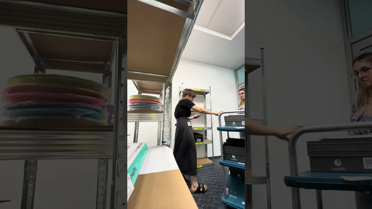
Based on the heuristic findings and research questions, I built 7–8 testing tasks, prepared minor design variants so I could test current and modified flows side by side, and set up the mock-up store with barcodes and printed materials that mirrored the real app.
Sessions ran smoothly and provided more feedback than I'd expected. Participants engaged deeply and flagged issues across the full flow, not just the areas I'd prioritised.
I documented everything in Miro and ran thematic analysis to pull out the patterns.

Tests & analysis
Based on the heuristic findings and research questions, I built 7–8 testing tasks, prepared minor design variants so I could test current and modified flows side by side, and set up the mock-up store with barcodes and printed materials that mirrored the real app.
Sessions ran smoothly and provided more feedback than I'd expected. Participants engaged deeply and flagged issues across the full flow, not just the areas I'd prioritised.
I documented everything in Miro and ran thematic analysis to pull out the patterns.
New designs
The test findings pointed to three main areas for improvement: stronger cues, clearer labels, and better grouping of information. These changes would help users understand what mattered most and what to do next.
The research also showed that the core concept was not the problem. Most issues came from how information was presented and prioritised. So, rather than redesigning the whole feature, I focused on improving clarity within the existing structure.
Presentation & outcome
I presented the full research findings and design recommendations to the team, walking them through the journey from heuristic analysis to test results to final designs.
I also reviewed the proposals with the Partner Success team, our primary client contact. They appreciated that no information had been removed. This meant the changes required minimal backend work, which made the path to implementation significantly smoother.
We first launched the redesigned flows in test stores to check if they worked well. Over the next six months, no additional related incidents were reported. After this, the changes were rolled out more widely.
Impact
The old screens had too much copy, which broke the layout when translated and led to regular complaints from clients across different countries and languages. To fix this, the redesign relied on icons and colour instead of text, giving us an interface that scales easily to multiple languages.
The biggest impact was on new operatives. The clearer flow was easy to learn and remember, so they could work independently earlier. Since clients' workforces have high seasonal turnover, this reduced training time significantly.
Client response also validated the direction. Several asked for the same clarity improvements to be applied to other parts of the app, showing that the approach solved a broader usability problem.
The project also helped the team see that meaningful design improvements were possible even with limited access to real users, using lightweight research methods to guide decisions.
Reflection
This project showed me how much is achievable when you plan around constraints rather than waiting for ideal conditions.
The biggest outcome wasn't the UI changes. It was the shift in how my new team viewed research. Before this, testing was seen as something requiring formal user access and significant setup. Afterwards, the team recognised that lightweight internal testing could surface real issues and build genuine confidence in design decisions.
It was also a clear example of high impact for low effort. The changes drove a measurable increase in customer satisfaction while requiring minimal engineering work: no backend changes, no system logic updates, just the right changes on the presentation of existing information.
Read next


Read next
Read next