
Role competencies
For large companies, understanding the skills required for each role is essential for hiring, promotion, and development. But when an organisation has hundreds of roles and thousands of competencies, this becomes a complex data challenge.
I led the end-to-end design of a tool that helps managers and their teams define, compare, and agree on the skills needed for every role across the business.
Requirement analysis
Information architecture
Interaction design
My role
Facilitated a discovery workshop with cross-functional partners
Defined the problem with stakeholders
Designed the IA, interaction flows, and visual details
Prototyped with realistic interactions and calculations to evaluate designs
Synthesised findings into the final design and handed off to engineering
Problem
Orgvue’s customers managed competency frameworks in spreadsheets, which was error-prone, inconsistent, and hard to review.
Managers needed a better way to assign competency levels, but comparing many roles side by side was overwhelming.
Solution
I designed a two-stage workflow that separates creation from review. Users first assign competencies to individual roles, then move to a comparison view with bulk editing and a conflict-resolution system designed for time-constrained approvers.
Impact
The project delivered a validated design direction: a two-stage workflow that separated creation from review, with a conflict-resolution system designed to make approval feasible at scale and reduce errors. The feature was in development when I left Orgvue.
Understanding users
To define the problem clearly, I brought together stakeholder knowledge through workshops and early discovery work. This helped me understand the different users involved in the process, the risks in the workflow, and what the design needed to prioritise.
I identified two core user groups with different needs:
Contributors (employees and managers) needed to assign competencies quickly, with clear guidance on what was expected for each role.
Approvers (managers and business leaders) needed enough oversight to review submissions, compare inputs, and resolve differences confidently before sign-off.
User goals
Two principles also emerged from the research and workshops:
High visibility
Managers needed to compare roles and competencies in one place. Without that, they could not spot inconsistencies, which was a key purpose of the tool.
High accuracy
Because these decisions influenced hiring and promotion, the output needed to be reliable. That meant review and reconciliation had to be built into the workflow.
Designing for visibility
The tool had to handle a lot of complex data: many roles and many competencies. At first, a single-page layout seemed like the easiest solution. But early sketches showed it would either feel overwhelming or make comparison harder by hiding too much behind filters.
I split the workflow into two pages instead: one for building and one for comparing. This matched how users naturally thought about the task: first set things up, then review them. And it also made each screen easier to use.
On the build page, users could add competencies with drag and drop or multi-select, with copy-paste and undo to make the process faster.
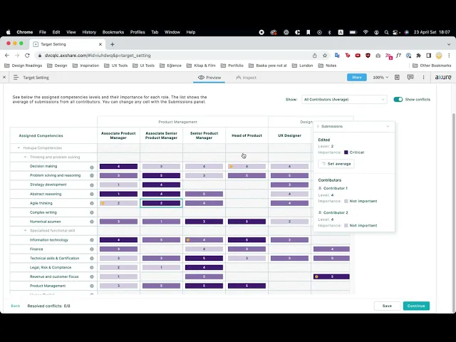
On the comparison page, a colour gradient showed importance. I flagged this as an accessibility risk, but we decided to move forward and monitor it.

Designing for visibility
The tool had to handle a lot of complex data: many roles and many competencies. At first, a single-page layout seemed like the easiest solution. But early sketches showed it would either feel overwhelming or make comparison harder by hiding too much behind filters.
I split the workflow into two pages instead: one for building and one for comparing. This matched how users naturally thought about the task: first set things up, then review them. And it also made each screen easier to use.
On the build page, users could add competencies with drag and drop or multi-select, with copy-paste and undo to make the process faster.
On the comparison page, a colour gradient showed importance. I flagged this as an accessibility risk, but we decided to move forward and monitor it.

Designing for accuracy
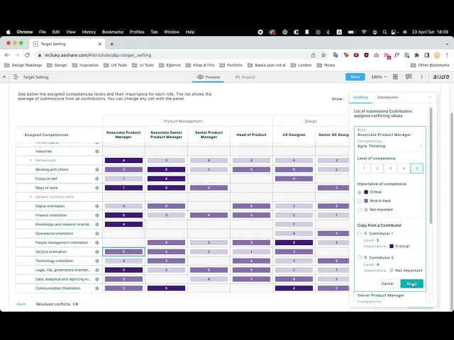
The harder part was the approver workflow. Approvers were senior, busy, and had to review submissions from multiple contributors, often with different answers. A long list of everything to check would likely be ignored.
I designed a conflict resolution system that showed only the areas where contributors disagreed most, so approvers could focus on what needed attention. They could choose one person’s answer, use an average, or enter a custom value, depending on what made most sense.

Designing for accuracy
The harder part was the approver workflow. Approvers were senior, busy, and had to review submissions from multiple contributors, often with different answers. A long list of everything to check would likely be ignored.
I designed a conflict resolution system that showed only the areas where contributors disagreed most, so approvers could focus on what needed attention. They could choose one person’s answer, use an average, or enter a custom value, depending on what made most sense.
Testing & iteration
To evaluate the design, I developed prototypes and tested how well each one supported review and decision-making.
I built the prototypes in Axure rather than a lighter tool because the product’s value depended on how the numbers behaved. Conflicts, averages, and weightings all needed to be calculated live. Testing a static mockup would have shown whether the layout worked, but not whether the logic made sense.
Testing showed where users understood the interaction model quickly and where they needed more guidance. It also helped identify issues with labels, control clarity, and how conflicts were surfaced.
Based on this feedback, I combined the strongest parts of both prototype directions into the final solution.
Prototype recordings
Rainbow spreadsheet

Final design
The final design created a clearer end-to-end workflow for assigning and reviewing competencies.
It allowed contributors to work efficiently across large data sets, while giving approvers the tools they needed to review, compare, and resolve differences with confidence.

Final design
The final design created a clearer end-to-end workflow for assigning and reviewing competencies.
It allowed contributors to work efficiently across large data sets, while giving approvers the tools they needed to review, compare, and resolve differences with confidence.
Final design
The final design created a clearer end-to-end workflow for assigning and reviewing competencies.
It allowed contributors to work efficiently across large data sets, while giving approvers the tools they needed to review, compare, and resolve differences with confidence.
Reflection
This project taught me that designing for complexity is not about removing information, but about organising it in a way that supports better decisions. In this case, the solution came from structuring dense data and role-specific needs into a workflow that felt manageable rather than overwhelming.
The biggest lesson was that opposing user needs can lead to a stronger design. The tension between Contributors, who needed speed, and Approvers, who needed oversight, shaped the two-stage workflow and conflict-resolution system.
If I revisited the project, I would improve the colour-gradient system with a more accessible alternative.

Read next


Read next
Read next